Features
Solutions
Pricing
Customers
Resources
Features
Documentation
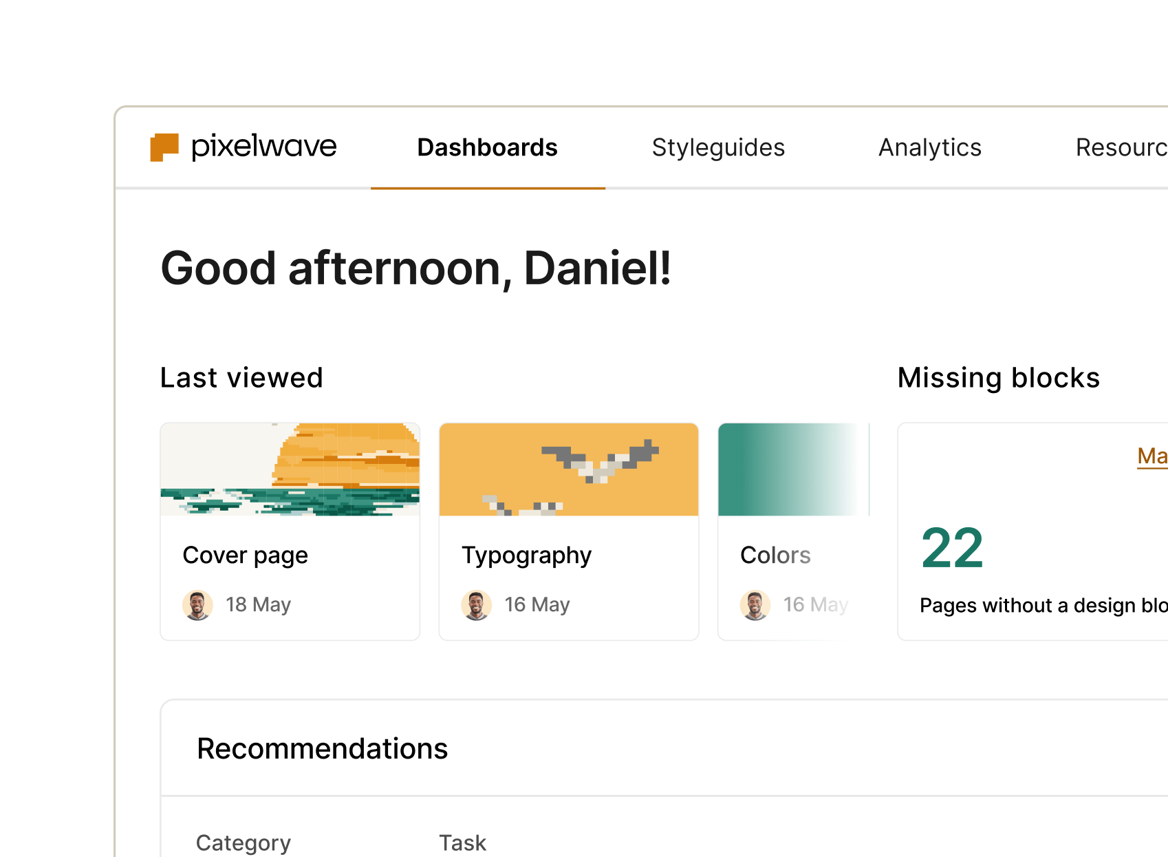
Create & update your documentation
Delivery
Deliver your design system
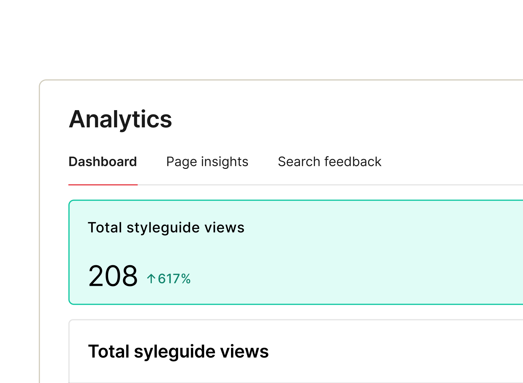
Measurement
Get insights on adoption & usage
Management
Automate workflows & improve security
More
Integrations
zeroheight AI
MCP
What’s new
Product Teams
Designers
Engineering
Leaders
Design System Maturity
Early stage
Scaling
Use Case
Enterprise
Multi-product
The System Stack
by
Browse all of zeroheight’s resources.
Learn
Blog
eBooks & Newsletters
Showcase
Get Involved
Webinars
Podcast
Converge
Get Support
Help Center
ROI Calculator
zeroheight 101
Accessibility
Trust Center
Design System report 2025
Join our
Slack Community
The System Stack
by
Browse all of zeroheight’s resources.
Learn
Blog
eBooks & Newsletters
Showcase
Learn
MCP Use Cases
Maturity Model Tool
Get Involved
Webinars
Podcast
Converge
Get Support
Help Center
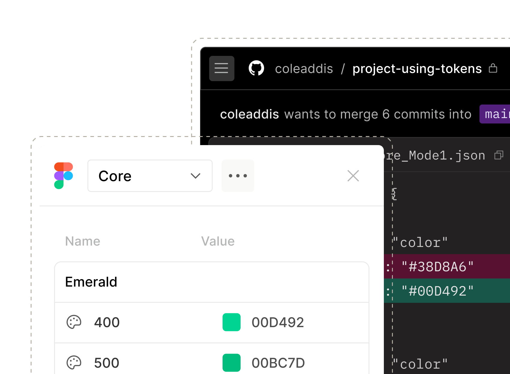
zeroheight API
ROI Calculator
zeroheight 101
Accessibility
Trust Center
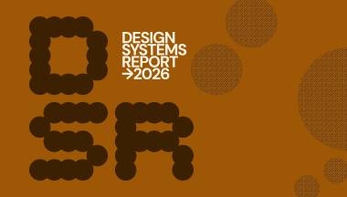
Design Systems Report 2026
Join our
Slack Community
Log in
Book a demo
Create account
