Customize styleguide colors with the theme editor
Nic Allen
All plans have access to the theme editor. The customization options available within the theme editor will vary based on your plan.
The theme editor allows you to customize the colors of styleguides built on zeroheight. This will impact the visual experience for editors, reviewers, and viewers. Read more about how themes work in zeroheight.
Launching the theme editor
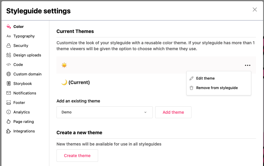
All customers can launch the theme editor from within a styleguide’s settings in the ‘Color’ section. You will see the options to create a new theme and edit existing themes.
Pro and Enterprise customers who have access to multiple reusable themes can also launch the theme editor from the themes section of the styleguides dashboard.
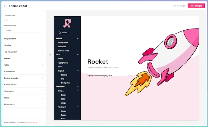
Previewing and making changes
The theme editor includes an interactive preview window of your styleguides. This is a preview of the viewer mode of your styleguides. You can click to navigate around the styleguide, allowing you to find different UI elements to help preview color changes in real-time.
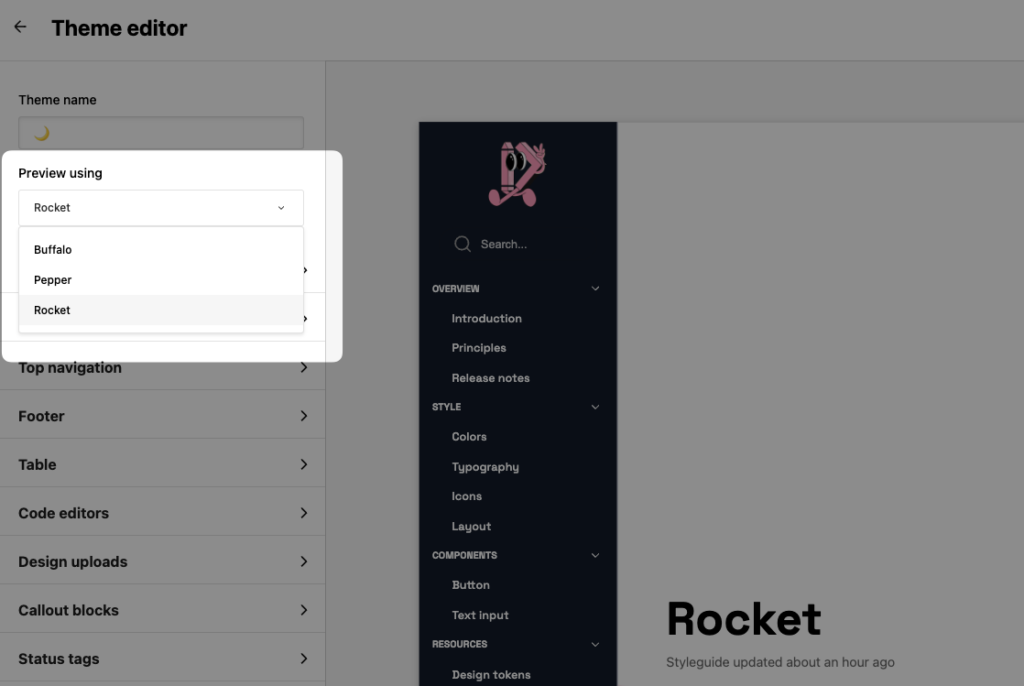
You can change the styleguide used to preview changes in the top-left corner.
To make changes to the color for an element, you can either click on the color swatch to use the color picker or enter a hex code. When you’ve made your changes, hit ‘Save changes’ for your edits to take effect.
☝️ Note: When you save changes to a theme, these will take effect in all styleguides that have that theme applied, not just the styleguide you are previewing.
Theme editor options
The different color options that can be customized are grouped by the section they relate to. These are mainly self-explanatory, but a guide is provided below to help identify some of the less obvious colors. For further information, please contact our support team via support@zeroheight.com
| Section | Element | Description |
|---|---|---|
| Page content | Accent | Used for various accents throughout zeroheight, most notably in the buttons in the cookie banner, password-protected pages and the search icon. |
| Page content | Secondary body text | Used for the category name that shows within a page above the title; also used for shortcut tile description |
| Page content | Placeholder text | Editor-only text that shows when a page or page intro is blank. |
| Page content | Active tab border | Used to show active tab within a page. |
| UI elements | Background | Background of elements such as the outline menu (sometimes referred to as the page contents menu). |
| UI elements | Action | Used in editor mode only to indicate actions (e.g. dragging blocks, saving a comment, opening block settings) |
Customization options by plan
The number of theming options available to editors will vary depending on their plan. Below is a summary of what customization options are available to each plan.
| Plan | Description |
|---|---|
| Free | Basic controls over text color. |
| Starter | Controls on some of the UI elements. |
| Pro | Full range of color customisation options, including the page background color. Can apply multiple themes to a styleguide. |
| Enterprise | Full range of color customization options, including the page background color. Can apply multiple themes to a styleguide. |