Should you document your design system in Storybook?
Jules Mahe
After exploring the topic of documenting design systems in Figma, we now shift our focus to the engineering side and delve into the use of developer documentation tools. In this article, we will examine the practice of relying solely on Storybook as the primary source of truth for your design system documentation. It is important to note that Storybook is an excellent solution for rendering UI components. Additionally, it works great with zeroheight as it integrates smoothly and is a perfect way to display live components for your documentation. However, using Storybook as the only source of truth for design system documentation can lead to several drawbacks. Let’s look at it and the alternative approaches to ensure a more comprehensive and effective documentation process.
A very attractive cost
One notable perk of Storybook is its cost-effectiveness. It is available for free, which allows teams to leverage its capabilities without any financial burden. Being an open-source tool, it provides access to a wide range of features and functionality without the need for licensing fees. But it is interesting to consider the real cost of this tool including the engineering and design effort to implement it. In the case of Storybook, the core work is to set it up so engineers can use it during development. In spite of this, maintaining, updating, and adding documentation features and patterns can be time-consuming and costly because of the complexity of the tool. It is also important to note that the primary purpose of Storybook is to build and render UI components. Utilizing it as a complete documentation solution for a design system may be considered a workaround or hack. While Storybook offers some documentation capabilities, it is not designed explicitly for comprehensive and customizable documentation. Therefore, relying solely on Storybook for design system documentation may require additional effort and compromises to achieve a satisfactory outcome. It is also important to remember that teams must host Storybook somewhere to be accessible throughout the organization. In most cases, this means choosing a tool like Chromatic or configuring it with a homemade solution to deploy automatically every time a change is made. In any case, this requires having technical knowledge and/or relying on the development team to deploy changes, which could cause additional delays.
Everyone should be able to access your design system documentation
Storybook is a front-end tool for building UI components and pages in isolation. That’s why it primarily targets developers, providing them with a convenient space to view, test, and develop individual components in isolation.
However, when it comes to communicating design system principles to non-technical stakeholders like designers, product managers, or brand managers, the isolated environment of Storybook might not be the most suitable platform. Just like Figma, one of the main drawbacks of documenting a design system within Storybook is the limited access and collaboration options for other cross-functional roles. Indeed, there are multiple blockers for non-developers from using Storybook as the sole documentation for your design system:
- Being familiar with Git
- Having access and permissions to contribute to a code repository, which can be something tightly controlled in organizations
- Knowing some technical basics such as markdown and MDX (a mix of Markdown and Javascript/JSX) which means that anyone who wants to edit also needs solid technical knowledge and understanding to use the Storybook solution.Â
And don’t expect your engineers to update your design system every time you need it, since it would be time-consuming, tedious, and resource-intensive in the end. Since changes will likely need to go through the normal code review process, it may take a while for the simplest documentation changes to be made, reviewed, deployed, and finally reflected in the Storybook. As a consequence, collaboration and documentation become tedious, strained, and difficult.

Design systems are already tricky enough to engage people around them. So, if you need to train your teams or require them to have some specific skills to use the tools for your design system, you’re adding barriers you don’t really need. Moreover, consider the learning curve everyone will need to master Storybook in your organization. Even if you take the time to train them, they’ll never be as efficient as a tech person.Â
When multiple team members need to contribute, edit, or review the documentation simultaneously, Storybook’s collaborative capabilities may fall short of expectations. Design system documentation should be accessible to all team members, regardless of their technical background, and provide a comprehensive understanding of the system’s overall vision, guidelines, and best practices. The simpler your documentation solution, the easier it will be for your teams to adopt it and the longer your design system will last.
A complex maintenance and time-consuming set-up
While Storybook proves beneficial for managing components in large-scale projects, the initial setup process can be time-consuming and intricate, particularly for those unfamiliar with it. The process involves configuring various settings, installing dependencies, and establishing a folder structure compatible with Storybook. A process that can be complex for people who don’t have technical expertise, such as designers or product managers. They’d have to rely on developers and/or have the right permissions, adding a lot of complexity to your design system even before starting. Furthermore, once set up, maintaining and updating Storybook can also consume a considerable amount of time. As the project progresses and new components are introduced, developers must ensure that Storybook remains accurate and up-to-date while ensuring the content they add meet accessibility standards. This can be a laborious task, especially in extensive projects with numerous components and if only devs have edit access. Consequently, the initial setup process of Storybook can be frustrating for developers who are new to the tool, often accompanied by a steep learning curve before achieving efficient usage. If this is challenging for developers, consider how much more challenging it would be for non-developers! Documenting components in Storybook follows a specific order. Adding usage guidelines requires that they be written somewhere. Most of the time, you need to wait until someone has built the component before you can document it. Failing to do so can result in inconsistencies or unusual behavior, particularly when referencing externally stored resources during the interim. Whereas with other solutions, such as zeroheight 😉, documentation can be initiated before the actual build, offering the flexibility for designers and developers to contribute in any order they deem appropriate within a neutral space.
Design system documentation requires content options
Navigation and information architecture
Storybook’s primary navigation is nested folder trees, which can be overwhelming for users to navigate and clearly find what they need. By default, Storybook doesn’t provide features like categorization, tagging, or easy navigation unless you use add-ons, plugins, and hacking solutions (we’ll discuss this later). Having more user-friendly navigation with clear levels can help you structure your design system documentation more conveniently and understandably for your users.Â

Moreover, when you store all your documentation exclusively within Storybook, it can be difficult to structure and find specific information, especially as projects expand with an increasing number of components and stories. Managing and organizing them effectively can become a challenging task. Developers often find themselves investing valuable time in organizing and categorizing their stories to enhance discoverability and navigation. Therefore, this process can be frustrating, particularly when working on large and intricate projects.
Rich media content and blocks
Your design system documentation also requires the inclusion of rich media such as images, videos, attachments, rules and written content to effectively communicate design principles, usage guidelines, and in-situation examples. While Storybook supports some level of content embedding (with a bit of extra work), it may not offer the same flexibility and simplicity that dedicated documentation tools provide. Storybook’s component-centric approach lacks the narrative structure often required to explain the reasoning behind design decisions, best practices, and usage guidelines. Documentation written in Storybook may appear fragmented and disconnected, making it harder for non-technical team members to grasp the overarching design principles.
Too many add-ons and plugins to rely on
Storybook presents a wide array of add-ons and plugins, tempting developers to enhance its functionality by incorporating these tools. While it may seem enticing to leverage these options for augmenting features and capabilities, it is crucial to consider the potential downsides. Engaging with a multitude of add-ons and plugins can introduce complexities and challenges to your Storybook setup. 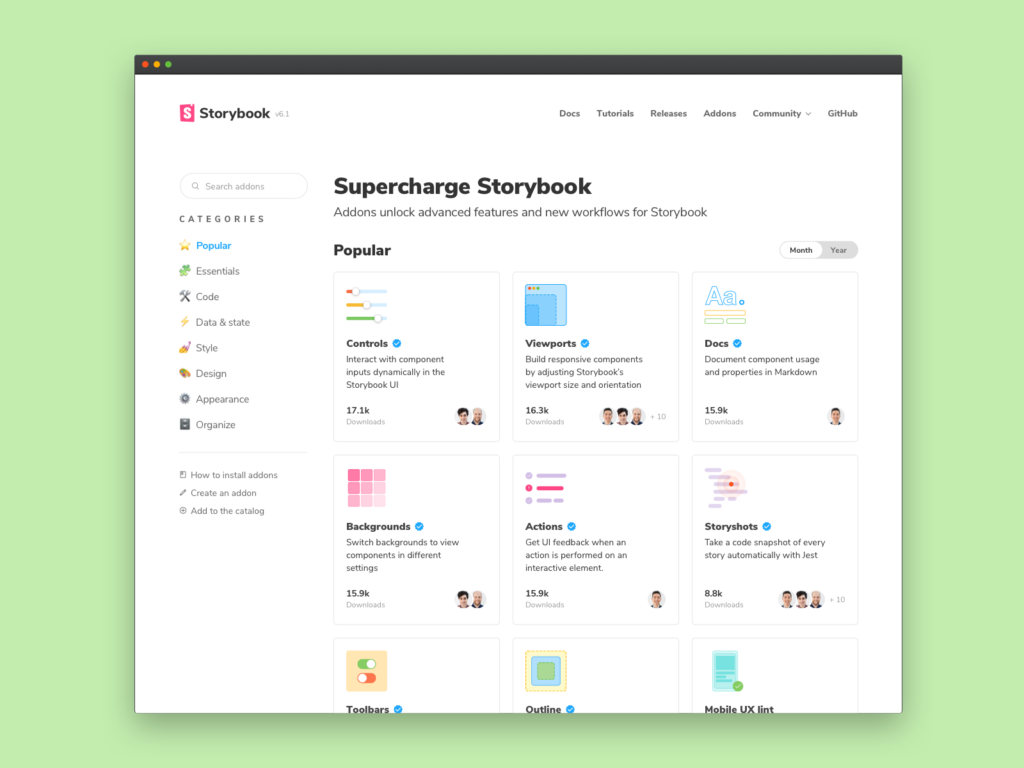 The process of integrating and managing these extensions may lead to increased maintenance efforts, compatibility issues, and potential conflicts among the various tools. Proceeding with caution is advised, as the allure of additional functionality can sometimes come at the cost of increased complexity, poor performance, and other potential drawbacks.
Customization
While a Figma file could be a good argument about the customization options, frustrations often arise when attempting to customize Storybook as a documentation platform. One significant challenge is the limited flexibility to tailor the visual presentation and structure of the documentation. Storybook’s default layout and styling options may not align with the desired branding or information hierarchy of a documentation site. Making even minor visual adjustments or incorporating custom branding elements can be time-consuming and require diving into complex configuration files, not to mention the style conflicts and all the extra HTML you’d need to add for very little value. As a result, it may hinder the ability to create a cohesive and consistent look and feel that matches the organization’s overall brand identity. These customization frustrations can impede the seamless integration of Storybook into the larger documentation ecosystem, making it challenging to deliver a cohesive and polished documentation experience.
Wrap-up
Storybook excels as a tool for building and showcasing UI components in isolation. Its interactive and component-driven approach is highly beneficial for iterative development within development teams. But it is important to recognize its limitations when it comes to comprehensive design system documentation. Relying solely on Storybook may introduce challenges such as:
- Limited team access and collaboration
- Complex maintenance
- Complex and time-consuming setup process
- Poor information architecture
- Difficulties in incorporating rich media content
- Dependency on numerous add-ons and plugins
- Frustrations with customizationÂ
Considering these drawbacks, exploring alternative documentation platforms dedicated to design systems such as zeroheight 😉 or a combination of tools that offer greater flexibility, simplicity, and customization options may be beneficial. When used alongside a dedicated documentation platform, Storybook can complement the overall documentation process by providing real-time previews and examples of components in action. It is, therefore, an excellent supplementary tool within a comprehensive documentation ecosystem.

Neglecting the importance of the documentation platform itself can hinder the successful adoption and utilization of the design system within an organization. By investing in a suitable documentation solution, teams can provide accessible, structured, and user-friendly documentation that facilitates collaboration and promotes the long-term success of their design system.
We’re curious to learn about your own experiences too. Have you successfully tried using Storybook as a sole source of documentation for your design system? How did it go? Tell us on Twitter or on our Slack community!