





Lessons from meerkats: How Compare the Market built their Design System
Something had to change, we couldn’t continue treating the Design System as a side hustle, and expect all of our products and services to adopt it.
Compare the Market started out building their Design System in 2018 but only as a side-project. By 2020 they realized the need for a dedicated design system team so pulled in Jason to work alongside an engineering team and product owner to build out their Design System.
How do you use zeroheight? How have you set up your Figma files to effectively manage the design system that works and syncs with zeroheight?
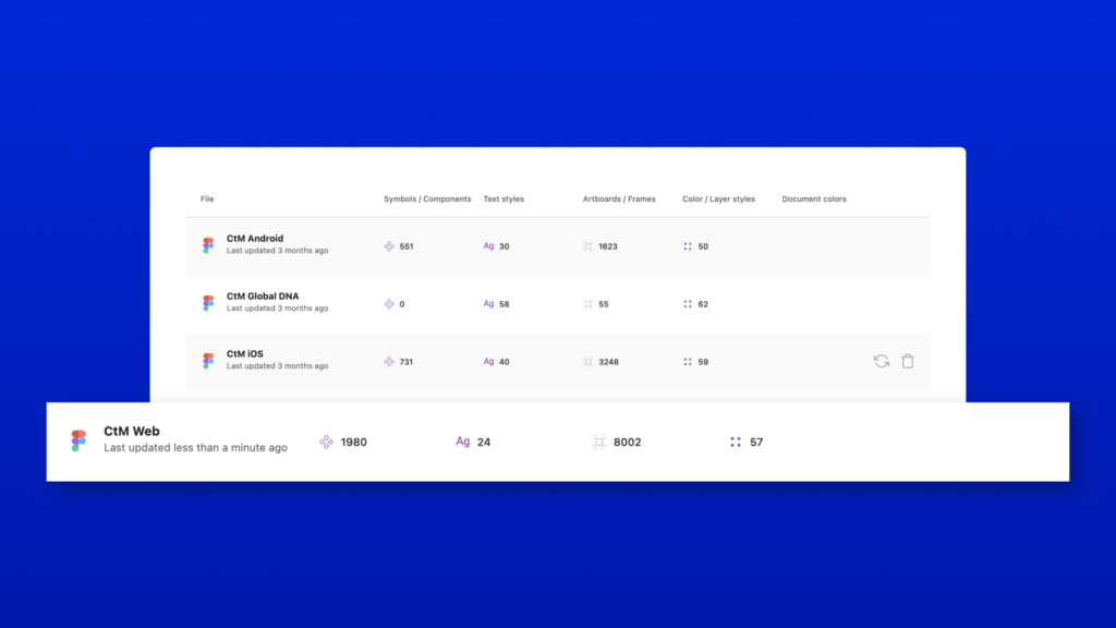
Our Design System originates in Figma, and is split across multiple ‘Projects’ and ‘Files’. We have gone down the route of cascading libraries – our DNA (this is what makes Compare the Market look like Compare the Market – logo, colors, typography, spacing, etc.,) sits at the top and feeds into other Design System libraries. We then split out our libraries by platform – Web, iOS, and Android. This is then ultimately reflected in zeroheight. We have a navigation item for DNA, Web, iOS, and Android. At a more granular level, in each library, we have a page per component. As of today, we have 3,000+ components (including variants) sitting in zeroheight, so it’s quickly become our single source of truth for people around the business.
Did stakeholders understand the value of design system documentation? If not, how did you convince them? How did you convince them to use zeroheight?
Compare the Market have understood the value of Design Systems and have for a while now, so there wasn’t any convincing needed, but what we had to do was spend quite a bit of time on choosing the right tools for us. There were lots of reasons why we ended up choosing zeroheight a couple of years back. A couple of really key benefits were the syncing between Figma and zeroheight, allowing us to have that true source of truth all in the same place. Building out the documentation requires no development resource, which means our teams can be much more efficient.
Design systems
What’s been your biggest challenge?
There are many daily challenges, but there are two that stand out; adoption and resource. On a day-to-day basis, we are having to make sure components are consumed, both from a design team perspective and also front-end. If components aren’t being consumed, we try our best to understand any pain points and frustrations and work out a resolution. Teams creating or customizing their own components happens less these days because we’ve put in processes and ceremonies, but I would be lying if I said I didn’t see at least 1 rogue design or component on a weekly basis. I think the adoption piece then plays into a resource challenge; in a large organization like Compare the Market, it’s really challenging being able to oversee everything that is being designed and built to make sure no rogue components are showing up, as well as the day to day work of building out the design system.
Why did the company put together a dedicated design team in 2020?
Something had to change, we couldn’t continue treating the Design System as a side hustle, and expect all of our products and services to adopt it. I was busy working on our app at the time, after launching our Open Banking Bill Checker project, I was asked to work on the Design System full-time.
What would you consider to be a successful design system? How do you encourage adoption?
A design system where the adoption isn’t questioned, it’s just something we do. To get to this point, I would like to think that multiple benefits would have been seen by the business, for example, efficiencies within design and engineering teams, speed to market, accessibility improvements, and just general consistency across the estate. The list goes on, but those are some things to consider to start with.
What advice would you give to someone who is starting to build a design system?
Keep communicating, document everything, publish little and often, have comfort in the knowledge it’s going to take time, and it’s okay that everything is going to take twice as long as you thought it would. Even now, 2 years in, I go to our daily stand-up with an idea of what I’m looking to achieve that day, and the chances are I will end up doing a bunch of work that isn’t what I had planned, but that’s okay, it’s all benefiting the system and getting documented.
How has your team or company benefitted from the use of a design system?
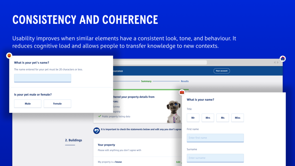
We now have a single source of truth we can all reference, from both a design team perspective and engineering. One of our designers recently replicated our full car insurance journey in Figma using design system components, and it only took 2 days. This would have been quite a large piece of work a year or two ago. These are the kind of efficiencies that need to be shouted about within an organization. There are also a lot of engineering efficiencies, but I’m massively underqualified to be talking about them.
Documentation
Why did you take an iterative approach to your documentation?
I mentioned earlier, it’s best to publish little and often; from experience, if you wait until something is perfect before publishing, you’ll likely never publish it, and the chances are you will always miss something. We have taken the approach to getting a component or pattern in a relatively good place, then getting it published and into development. Without a doubt, as the components go through the engineering stage, there will be questions or scenarios we need to capture, so we’ll continue to iterate. Even when products and services consume the component, there may be things we need to document or update. A lot of our documentation in zeroheight comes from conversations with engineering and product execution.
What did you include in your first version?
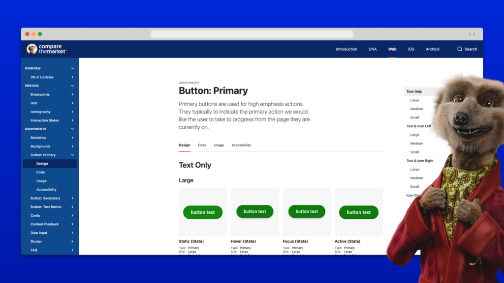
We started with our DNA, including colors, typography, etc, which then fed into our first component, our primary and secondary buttons. It’s really important to get the foundations right before rushing off and creating loads of components/patterns. We track everything that gets created and updated in Figma through to being published in zeroheight, and they fall into one of the following categories: New Component, Component Improvement, or Documentation Improvement. Because we’ve got this level of information, I can show you exactly what our first zeroheight release looked like after the initial connection:
24/07/2020 Design System Updates
- New Component: Switch
- New Component: Star Rating
- New Component: Loading Spinner
- New Component: Buttons with Loading Spinner
- New Component: Feedbackify
- New Component: Text Input with Unit (both right and left variations)
- New Component: Modal Close Warning
- Component Improvement: Colour – Added CTM & Reward gradients
- Documentation Improvement: Typography Mixins
How did you decide on your documentation structure?
It’s exactly the same as Figma, which is also the same as Storybook. We wanted everything to be aligned, so we are all singing from the same hymn sheet.
Compare the Market’s Team
How do you build a community around your design system? How do you encourage contributions and feedback?
Divide and conquer! Our dedicated front-end engineering team is constantly talking to the engineering community, along with regular showcases, etc. From a design perspective, we are in constant communication with design and product teams, and then the most important part of this for me is that every week we, design system designers and front-end engineering, have time set aside to talk about any feedback, issues, ideas, tickets, etc. We want to get to a place where people across the business can feel like their feedback, opinions, and ideas are welcome, and where people actively want to contribute to the design system.
In order to maintain the consistency of the design system, what does the contribution model look like?
We have a playground in Figma where designers can start this contribution process, this could be a totally new component or a tweak to an existing one, but it’s an area we can work through a component until it’s good enough to be moved into one of the main libraries, and then into zeroheight. We have a checklist of criteria that needs to be met before something is published: All interactive states, all available options, defined behaviors, usage guidelines, accessible contrast, keyboard interactions, inspection available, and validation.
What does your process look like for creating and approving new components in your design system?
Generally, it’s quite a lean and quick process actually (I might be biased, though ); initial designs are placed into the playground, and we’ll spend a bit of time with a designer working through the checklist. We’ll get some feedback from the wider design and engineering teams, and if we need to iterate, we will do. If it’s all looking good, we’ll get it into Figma, published to zeroheight, and then over to engineering for the build. Depending on the complexity, we might jump back in at the end to test and sign it off. Once it’s been built, I’ll make sure everyone is aware it’s available to be consumed by design and engineering.
How do you document and share research?
Our research team currently documents everything in Confluence, so most of the time, we will link directly from zeroheight to Confluence for any insights.
Design System measurement
How do you measure the effectiveness of your design system? How much are components being used? How do you measure progress?
This is definitely an area we need to spend a bit more time on – I would like to see some KPIs introduced at some point, so we can track overall effectiveness. On a more granular level, we have recently just upgraded our Figma license, so I can start to look at what components are being detached. It’s important to understand the why – and how we can make any improvements to stop the detaching from happening again. Or it could be an education piece, maybe there are better alternatives. Our design backlog sits in Jira so we can track the progress that way, and it’s another way for designers or product to raise any feedback, issues, and ideas.
How do you plan on measuring moving forward?
I think the introduction of some KPIs will help us. We’ve also started to build out a survey we plan on sending to key stakeholders around the business.
Looking toward the future
How do you think design systems will change in the next 3 years?
As technology continues to improve, I do wonder how much design work could or will be automated based on a design system, or a set of design rules. Take a form, for example, if a question, inputs, buttons, spacing are all defined within the system, could a design tool or plugin just produce this instead?