


Understand what's working in your docs
See what gets read, what gets ignored, and what teams search for but can't find – so you fix the gaps before they become questions and workarounds.

See where teams go off-system
Know which components are used in production, which are hardcoded, and where drift is building before it reaches shipped code.

Prove the ROI
When leadership asks, you'll have the answer – adoption trends, consistency improvements, and proof that the system is being built with.
Measurement / Measure Adoption
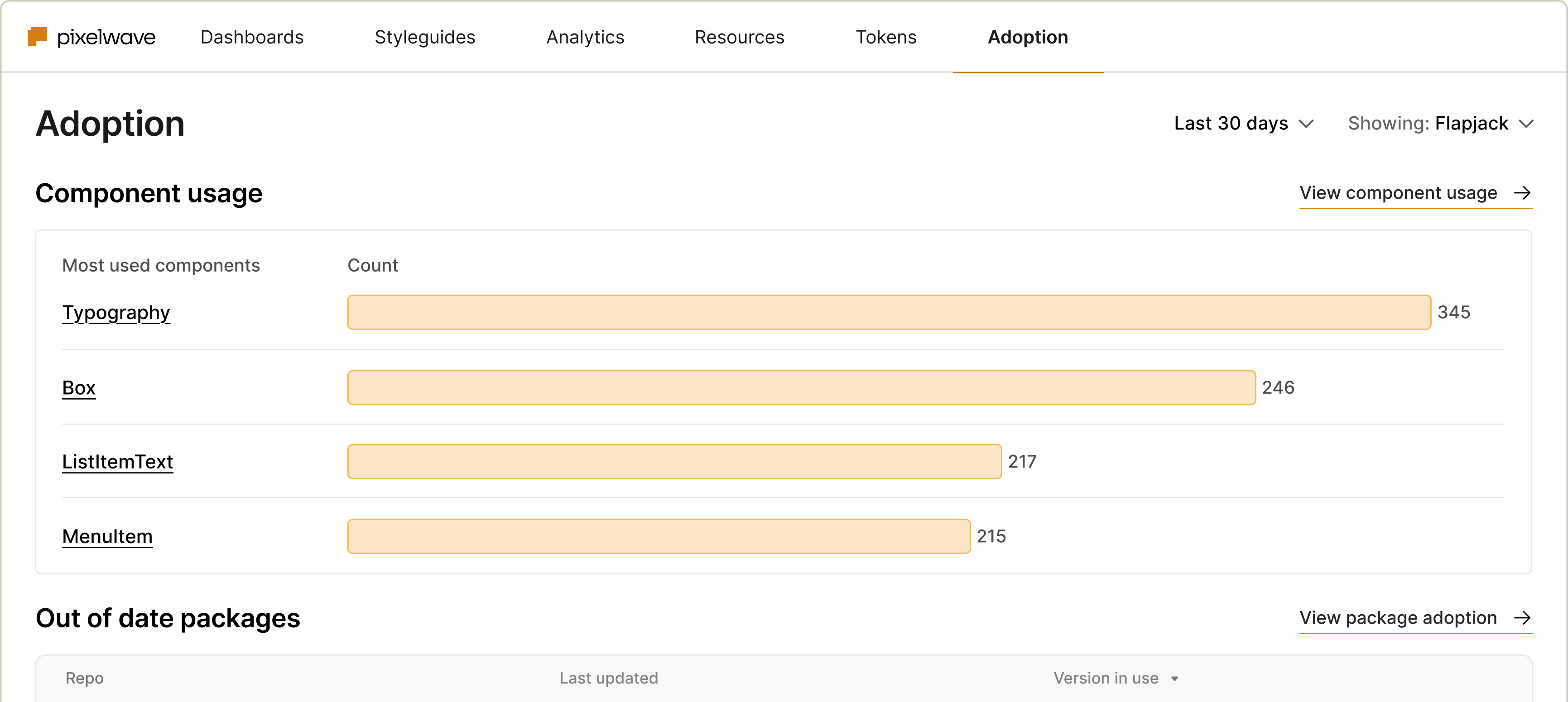
See what actually makes it into products
Track components, tokens, and packages in production – and spot where teams are hardcoding values or using deprecated versions. Know what’s adopted, what needs updating, and where debt is building before it ships.
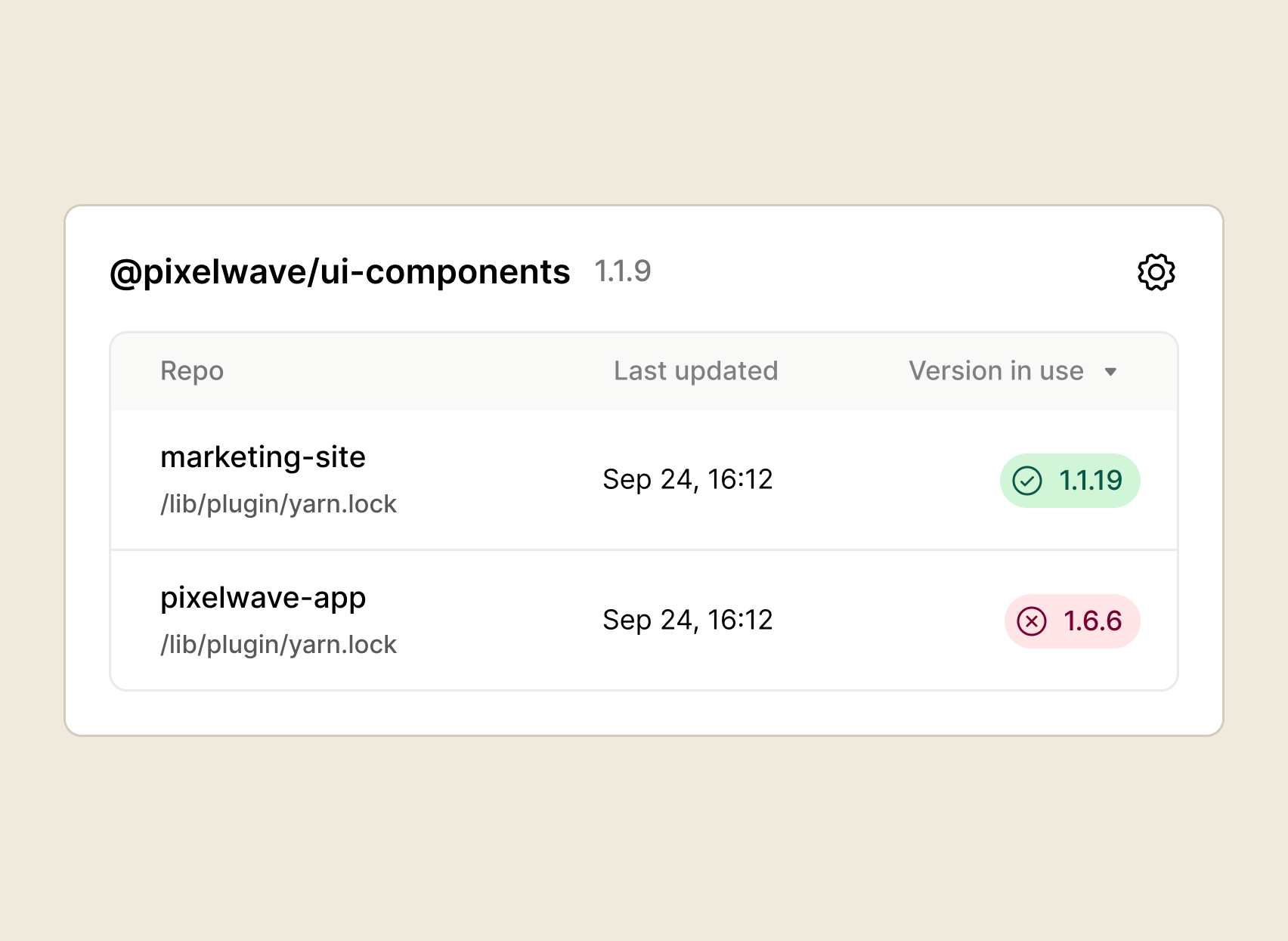
Package adoption
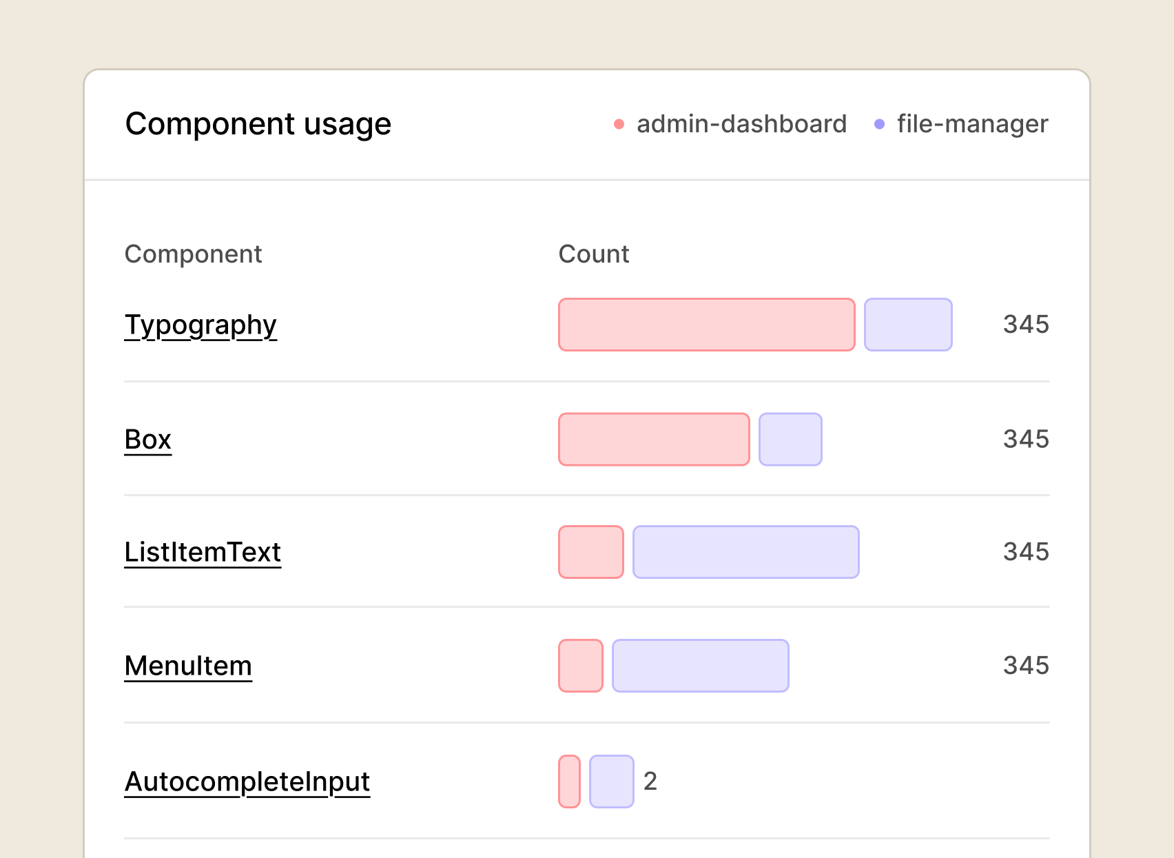
Component usage
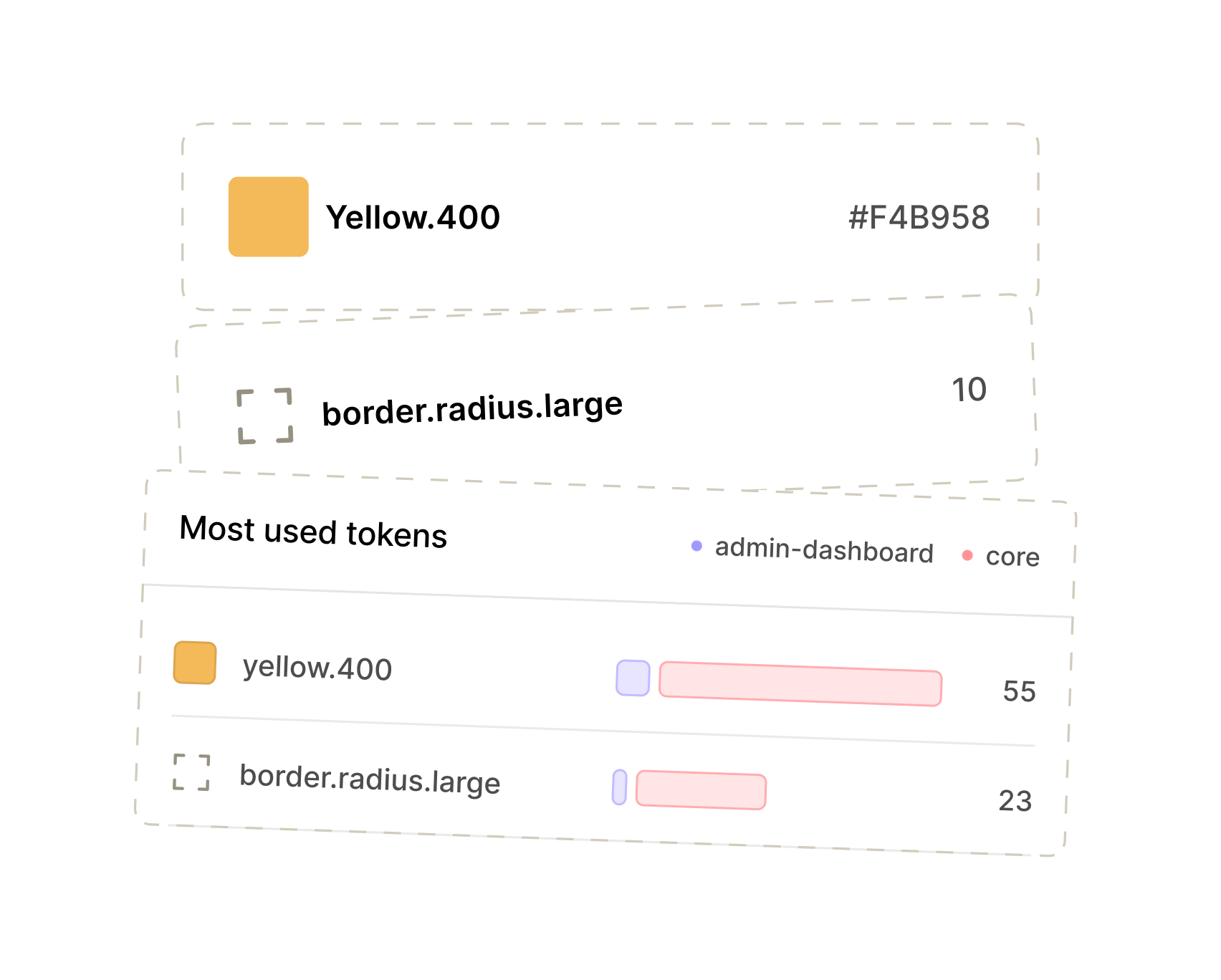
Token usage
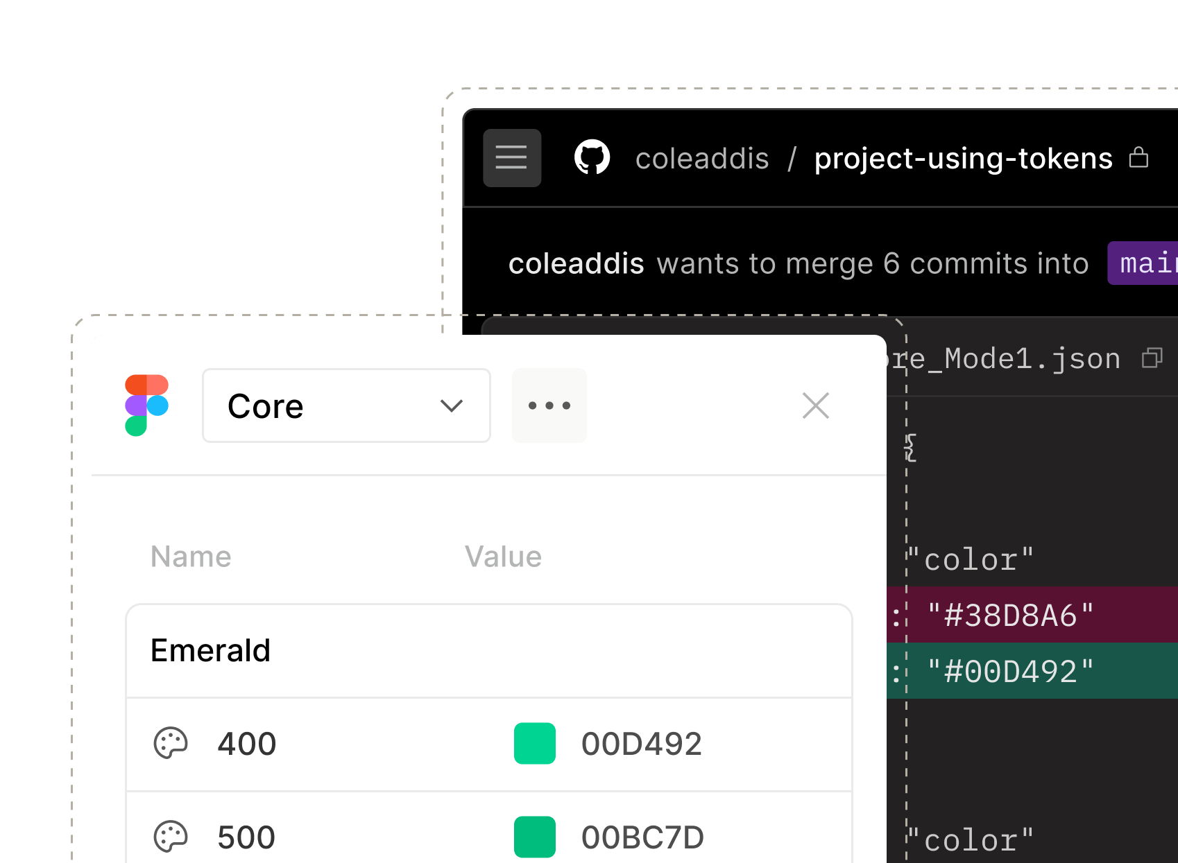
Know which tokens are being used and where raw values are sneaking in. Catch drift before it compounds.

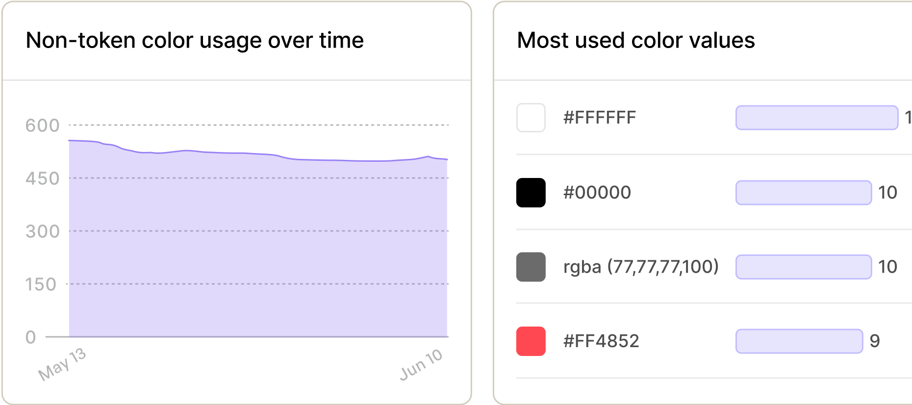
Color usage
Catch off-brand values in production before they spread. Know where your palette is being followed – and where it isn't
Management / Track Usage
Make better decisions about your docs – with data
Stop guessing what’s landing. See how teams consume your docs and know exactly where to focus – before unclear guidance turns into bottlenecks and workarounds.
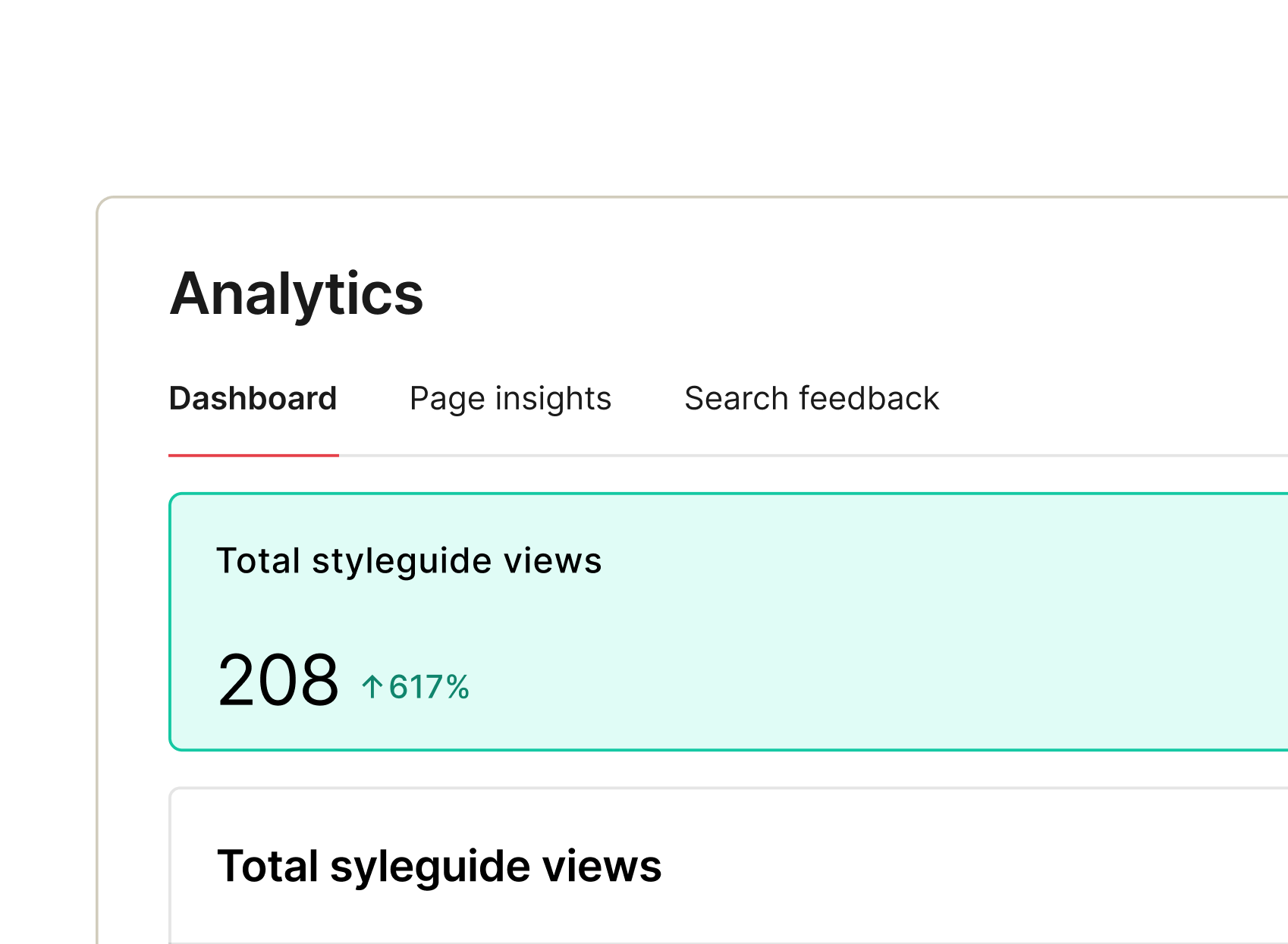
The full picture of how teams use your docs
A complete suite of doc analytics – what gets consumed, where teams get stuck, and what they can't find. All in one place.
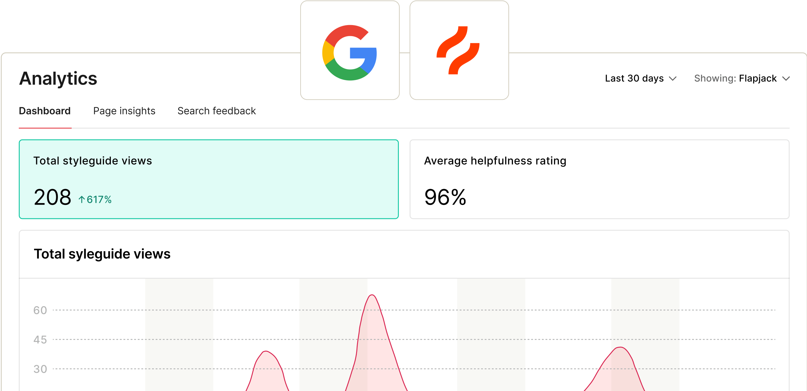
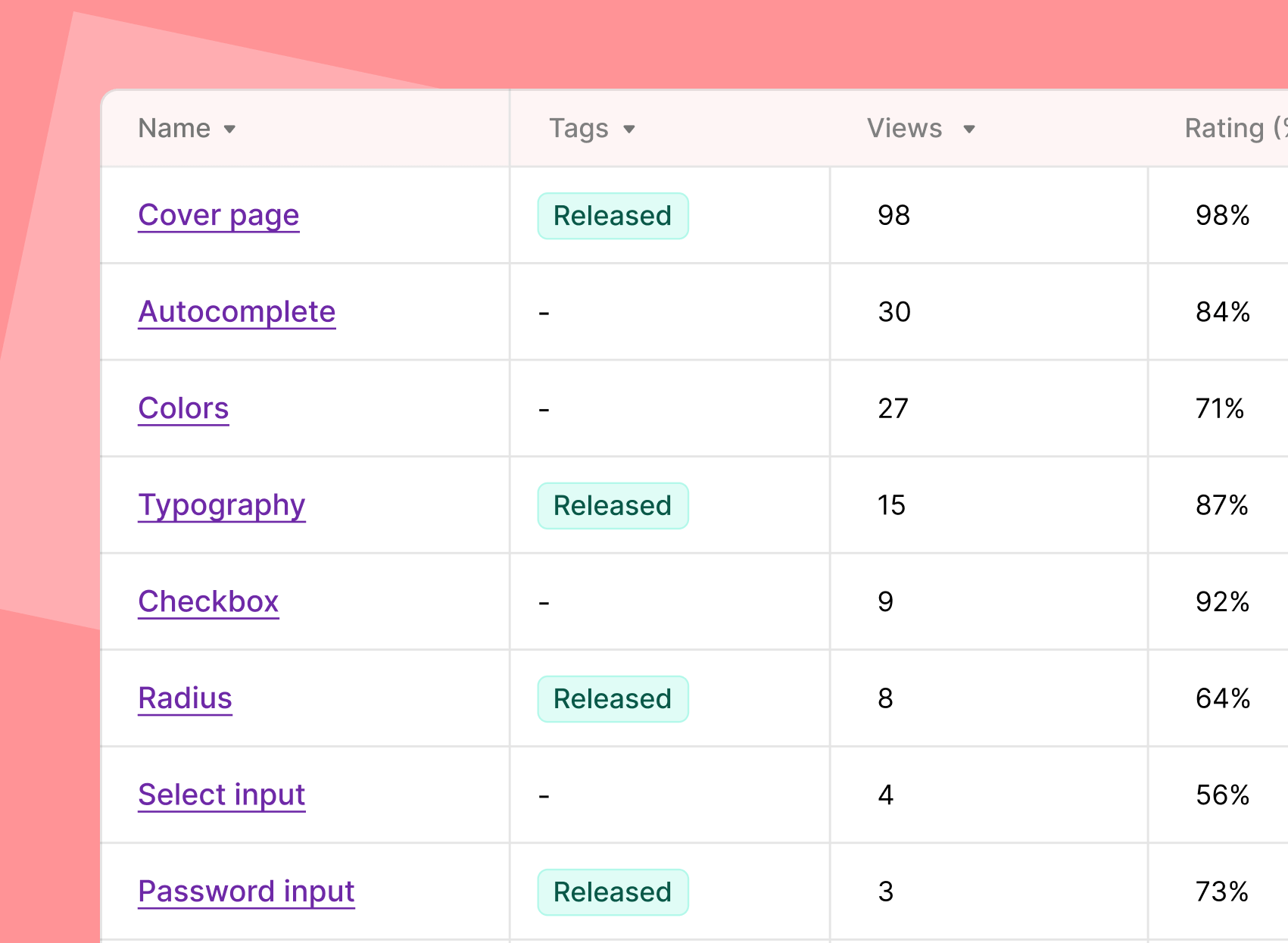
Docs engagement
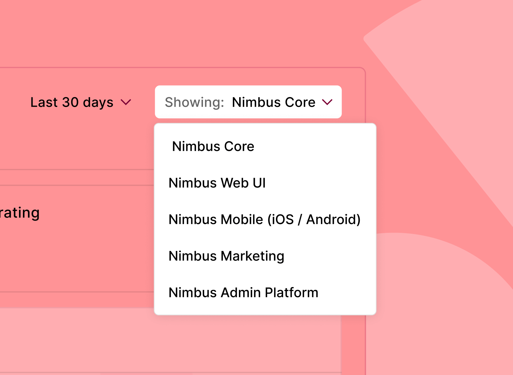
Multi-product analysis
Analytics Integrations


Measurement / Collect Feedback
Collect feedback from the people using your system
Feedback in context, in one place – so you always know what’s working and what needs fixing.


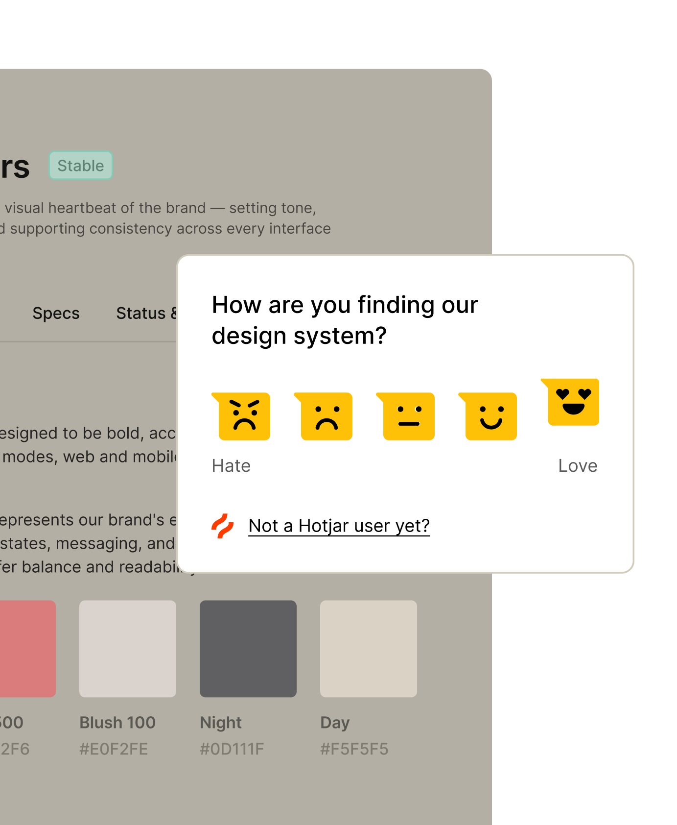
Hotjar surveys
Use Hotjar to run surveys on your site and collect feedback from viewers. No mind reading required.
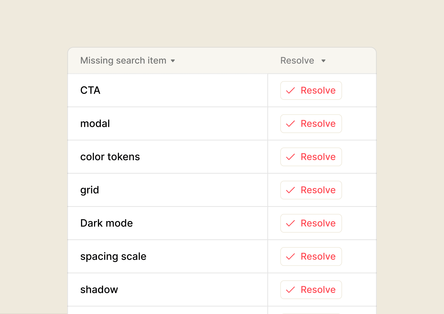
Search analytics
Inline feedback
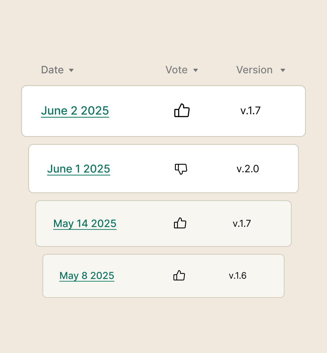
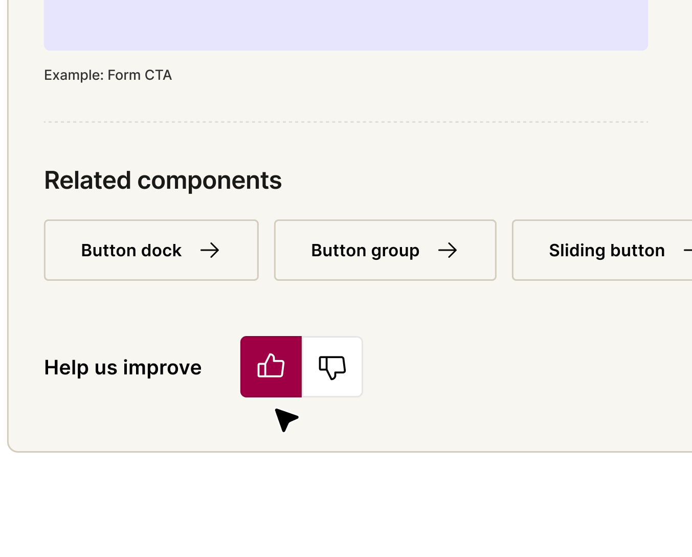
Feedback footer
Let teams rate every page as they go – so you build an ongoing picture of what's working and what isn't.
Your system’s working. Now make it unstoppable.
You’ve measured impact, made refinements – now it’s time to put those insights to work. From smarter governance to easy deployment, zeroheight helps your system get adopted.
Documentation
Connect, customize, and launch your doc site into the stratosphere. zeroheight keeps your design system docs organized, up to date, and ready for your whole team to use.

Delivery
Measurement What’s in progress or adopted? What’s outdated or missing code? Get the fast answers on what’s happening and what needs attention.

Management
See the health of your whole system – think mission control for your design system. Surface insights and prioritize like never before. Manage roles, permissions, and SSO for hassle-free enterprise collaboration.

FAQs
- What does zeroheight's design system measurement platform track?
zeroheight measures design system adoption end-to-end — from documentation engagement to component usage in production code. It tracks which components are used across your codebase, identifies outdated implementations and hardcoded values, shows which documentation pages get read and which get ignored, and surfaces what teams are searching for but can’t find. Everything is available in a single dashboard so design system teams can prove impact and prioritise what needs work.
- How does zeroheight track component adoption across codebases?
- Can zeroheight show the ROI of a design system?
- How does zeroheight collect feedback from design system users?
- Does zeroheight integrate with existing analytics tools?